Overview
Webex Contact Center is a customer experience platform helping businesses connect with their customers through multiple channels — Voice, Chat, Social media, and Email.
Extensible Supervisor Desktop is an all-in-one cloud solution that is built for Supervisors in a Contact Center. It offers tools to manage teams, coach agents in real-time, respond to customer interactions, and view detailed reports.
The Problem
Team Performance is a popular tool used by Supervisors on the existing on-premise Cisco Contact Center. Supervisors use it to monitor Agent interactions, coach, track the current status of their teams to make informed decisions such as adding more agents to a busy queue, etc.
While porting this experience to the cloud-based Webex Contact Center, we had these challenges:
- The existing solution was designed only for voice and didn't support omni-channel communications such as Voice, Chat, Email, and Social media.
- The design of on-premise Contact Center was not consistent with the rest of Cisco Webex design as it came out of a prior acquisition.
- The data and reporting was limited. Analyzer (reporting tool for the Webex Contact Center) recently streamlined reporting and added much more reporting functions which were missing in the existing solution.
Our goal was to design an experience for Supervisors that addressed these challenges, also considering long-term user needs who have years of learned behavior and customization with the on-premise solution.
My Role
I was responsible for leading the UX Design and Interaction Design for the Team Performance experience. I partnered with cross-functional members including UX/Visual Designers, PM, and the Product Leadership team for this project.
As I was still onboarding to Cisco and the team during this project, I also collaborated on a weekly-basis with other designers to understand the existing platform, and spent time on my own going through documentation and webinars to understand the domain.
Research
Usually when starting a project like this, I'd like to set up a baseline understanding by speaking with the users of the product, going through existing designs, and mapping the existing system.
At the time of joining this project, PM and another UX designer on the Supervisor Desktop design team had just concluded a series of user interviews. I went through the recordings, specifically noting feedback and thoughts around the Team Performance experience.
Based on this, I identified the following insights:
- Users preferred a tabular data-view and wanted ways to customize to suit their specific organizational needs.
- Users preferred relevant contextual-actions to be available without them having to search for them.
- Monitoring a call was the most commonly used action by the Supervisors on day-to-day basis and wanted a way to easily access it.
Empathize
As the UX team didn't have direct access to users as the project progressed, we leveraged product management as a proxy. Our PMs have deep domain expertise and insights based on their past interactions with users. We collaborated with them extensively to gain an understanding of scenarios and user needs.
Additionally, as I was going through earlier user interview sessions, I took notes of some of the scenarios that the users mentioned. Using these, I prepared a set of user flows.
User flow mapping
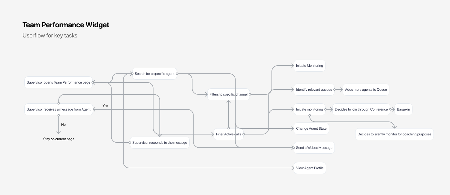
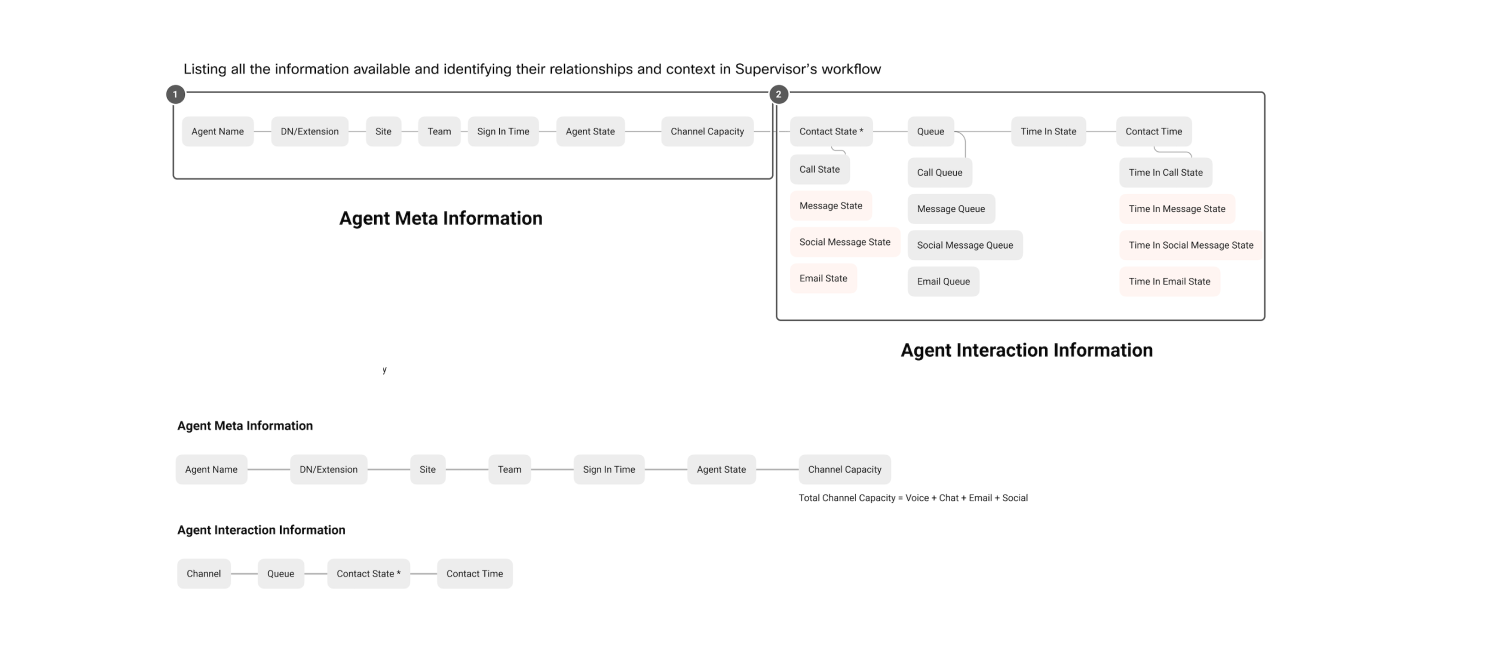
Data-organization based on use cases and user needs
In this step, I focussed on identifying logical groupings of data for accomplishing user tasks based on the scenarios identified in earlier stages of the design process.
Ideation
To kickstart brainstorming the interactions and overall UX for Team Performance, I broke the experience into two major parts.
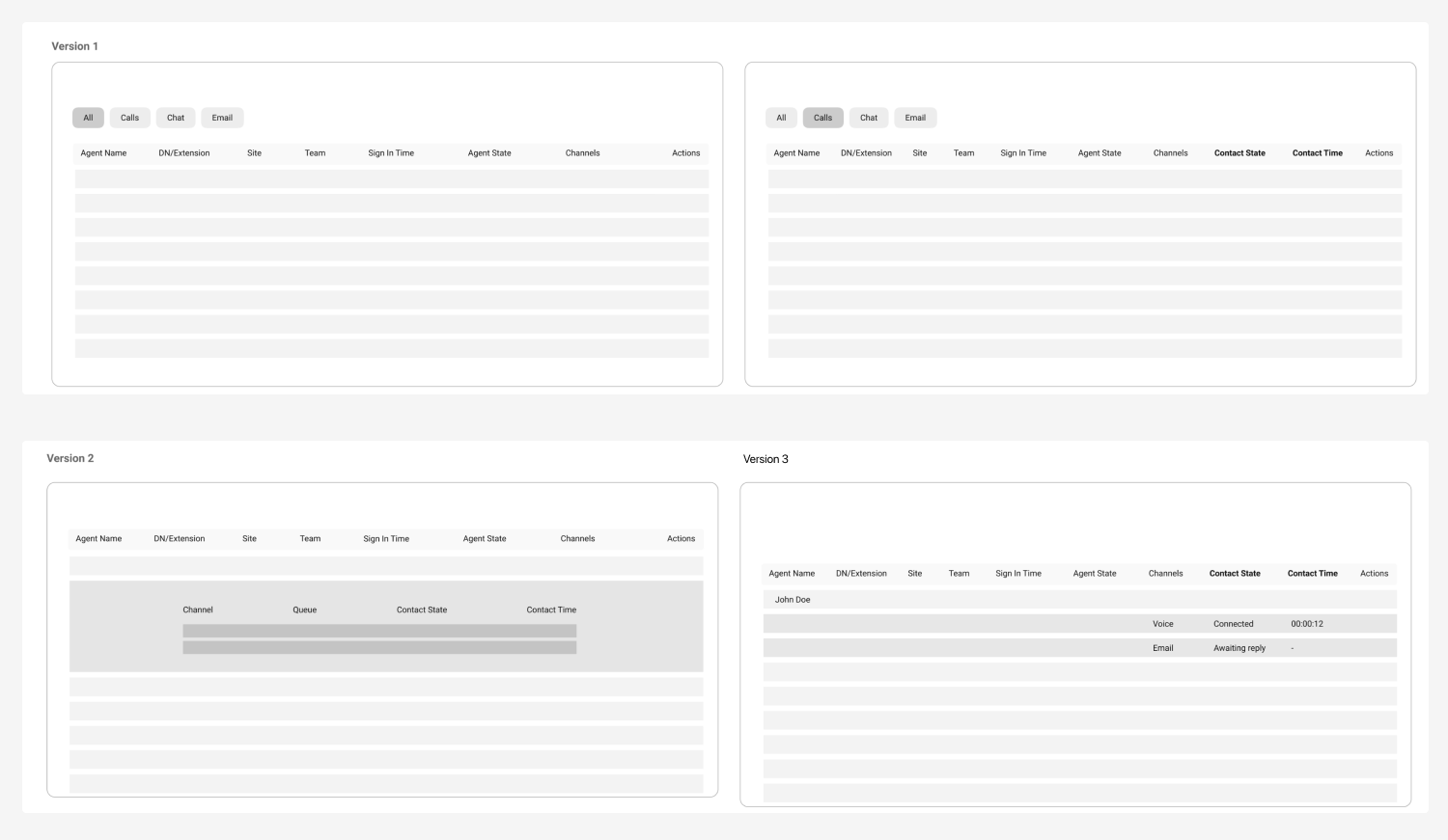
1. Table — Interactions, Data-organization and hierarchy
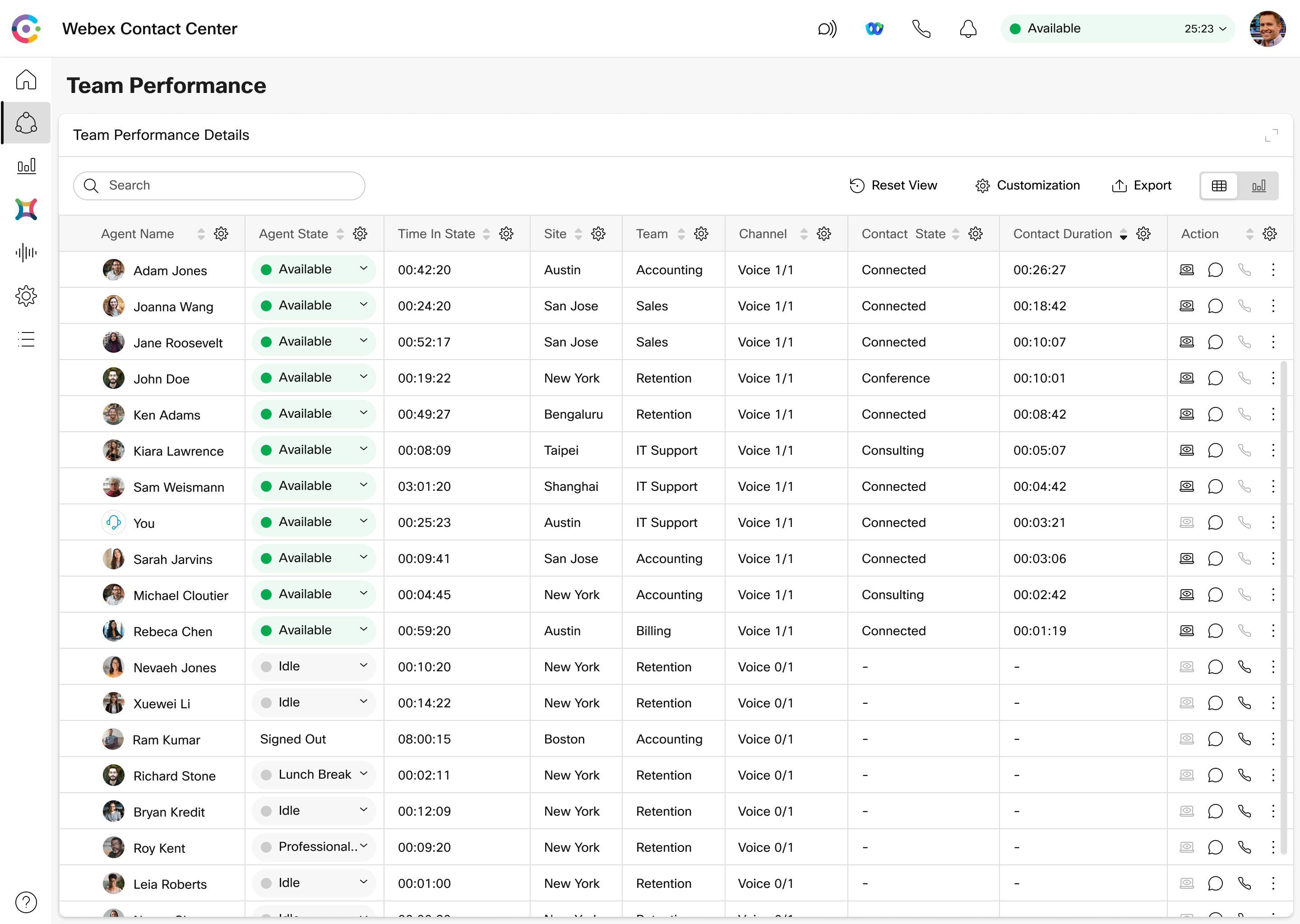
As users preferred a table view for Team Performance based on their familiarity and use cases within the existing on-premise solution, I explored and made three wireframe versions of the table. We conducted multiple internal design reviews to discuss and finalize on the direction.
2. Active Interaction Details and Call Monitoring
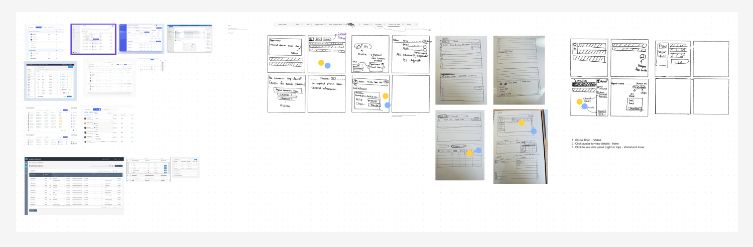
The existing on-premise solution only supported voice call monitoring. For omni-channel monitoring on the new experience, I led a Crazy-8 sketching exercise with the Visual Designer to explore different ideas. As part of this exercise, we also did lightning demos to do a quick round of competitor analysis.
High-fidelity Designs
This is a limited preview of the designs to comply with the non-disclosure agreement.
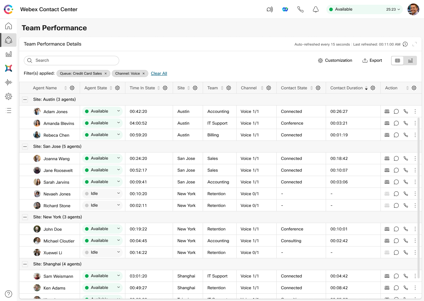
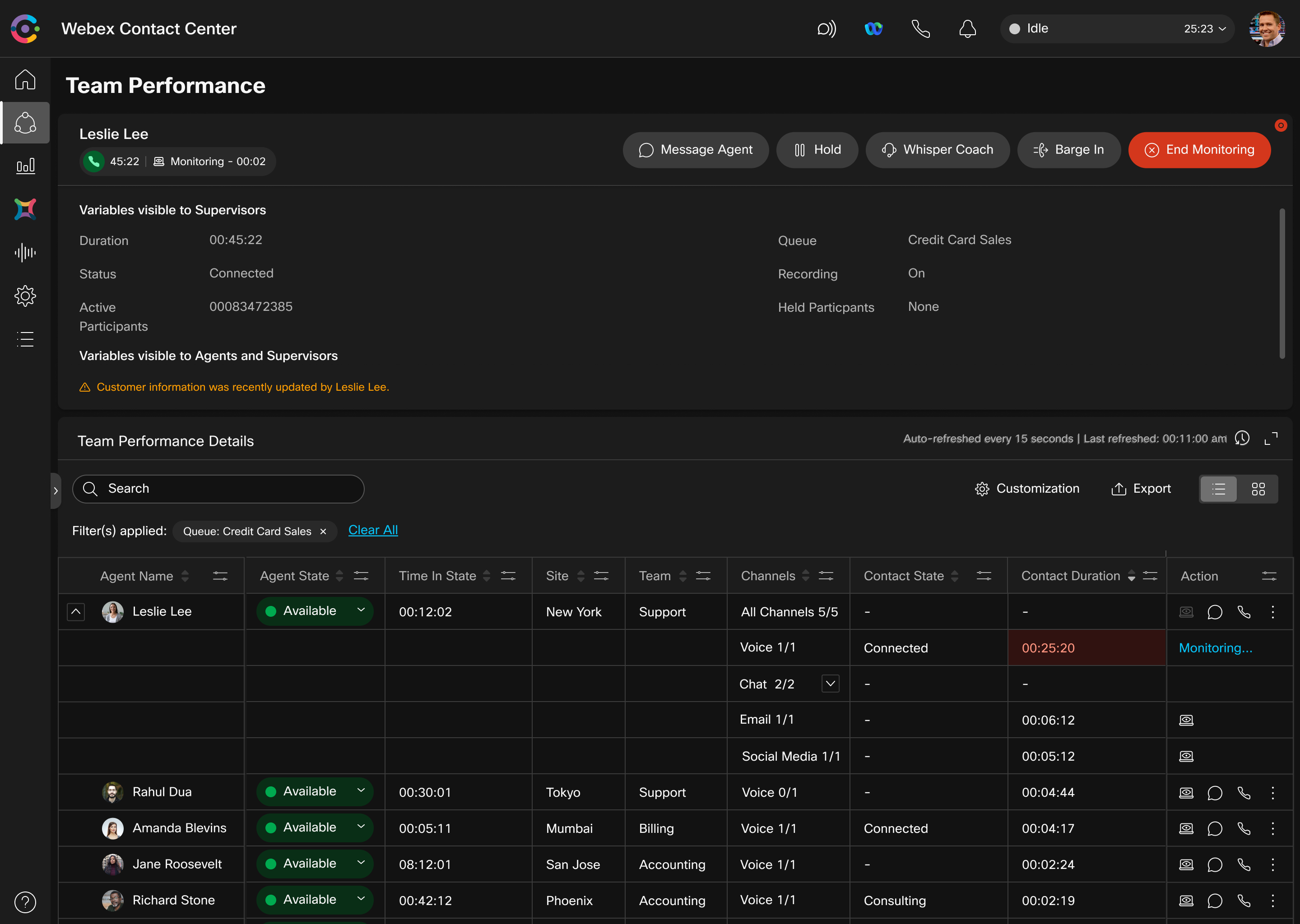
Team Performance Page
For the table design, we leveraged the existing Webex Design system component for most parts. I worked with the Visual Designer to define additional interactions such as Pinning, Column-level filtering, Grouping, and Saving Views, which were later added to the Design System.
We also designed dark-mode versions in parallel to these designs.
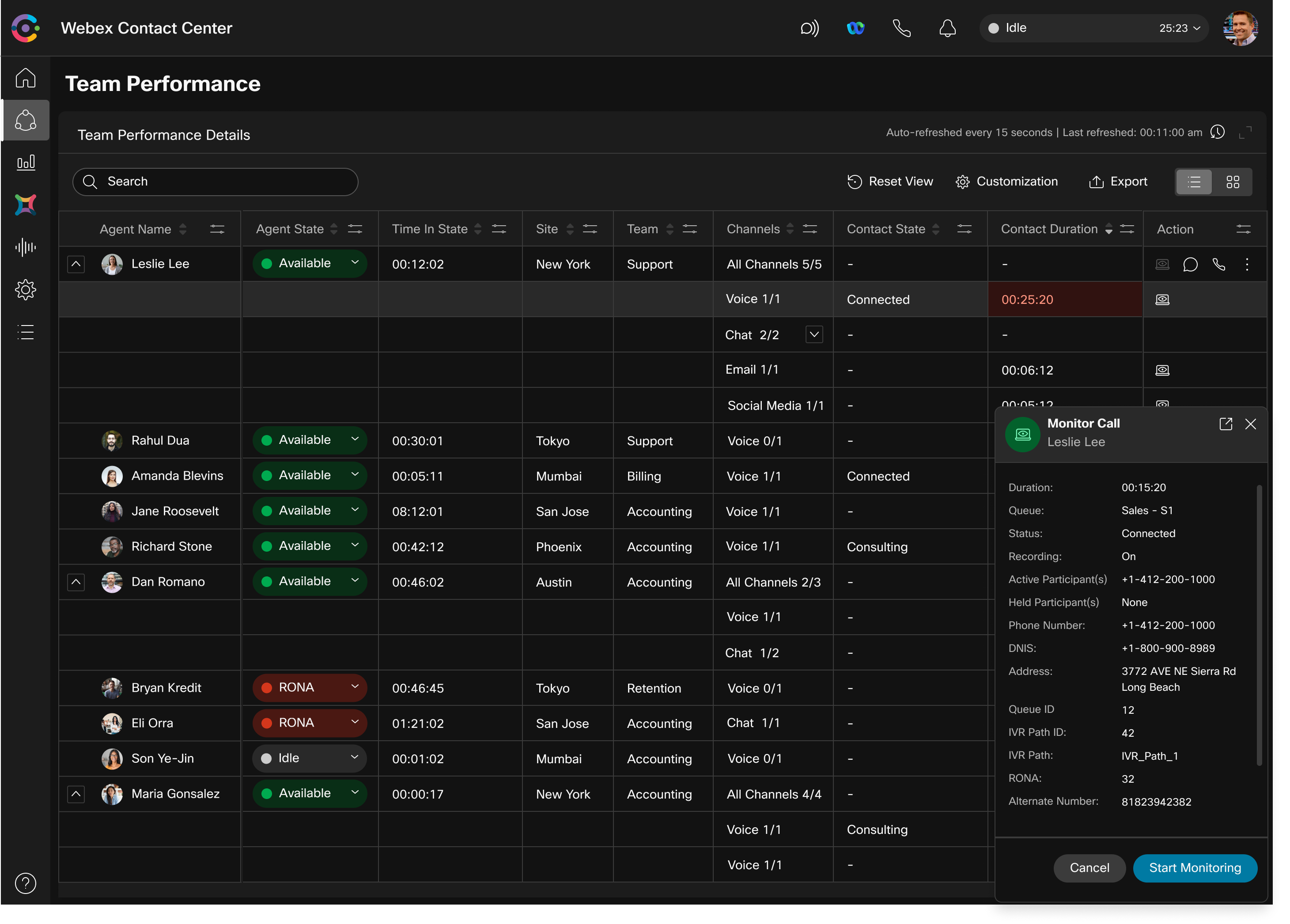
Active Interaction Details and Call Monitoring
We iterated several different options for Active Interaction Details and Call Monitoring. To help narrow-down and to build cross-functional stakeholder alignment, I used user gaze estimation for each iteration based on N/Ng eye tracking studies.
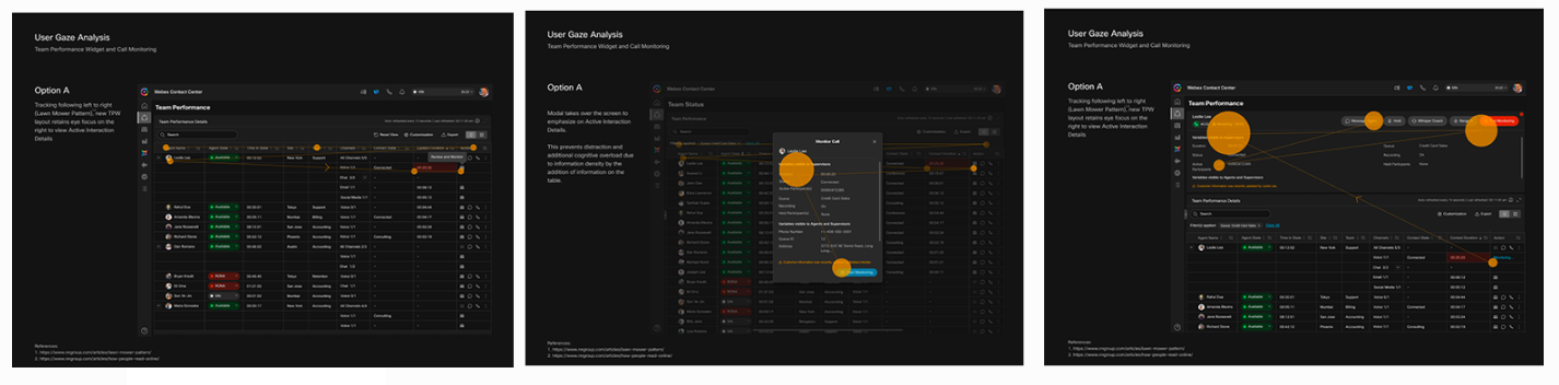
Through this, we were able to narrow-down to two options — Popover, and a persistent monitoring control at the top of the page.
Localization
As Webex Contact Center will be used by users across the globe, we made sure the design scaled to accommodate localization from the get-go.
For localization, we chose Polish, German, and Russian as they had relatively longer string titles.
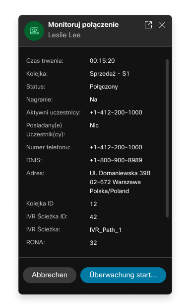
Motion prototypes for popover
We received feedback that the popover design when initiated was not prominent as an active task. This problem was more pronounced on dark mode.
To address this problem, I explored multiple motion design ideas to indicate ongoing monitoring action. Based on internal design reviews, we chose to move forward with Version 5 (Pulsating Monitoring Icon with adjusted timing (softer)).
Based on engineering constraints and product timelines, we decided to move forward with the persistent top control for the Active Interaction Details and Call Monitoring.
Final Design
Here is a video of the final design covering different interactions in the Team Performance experience.